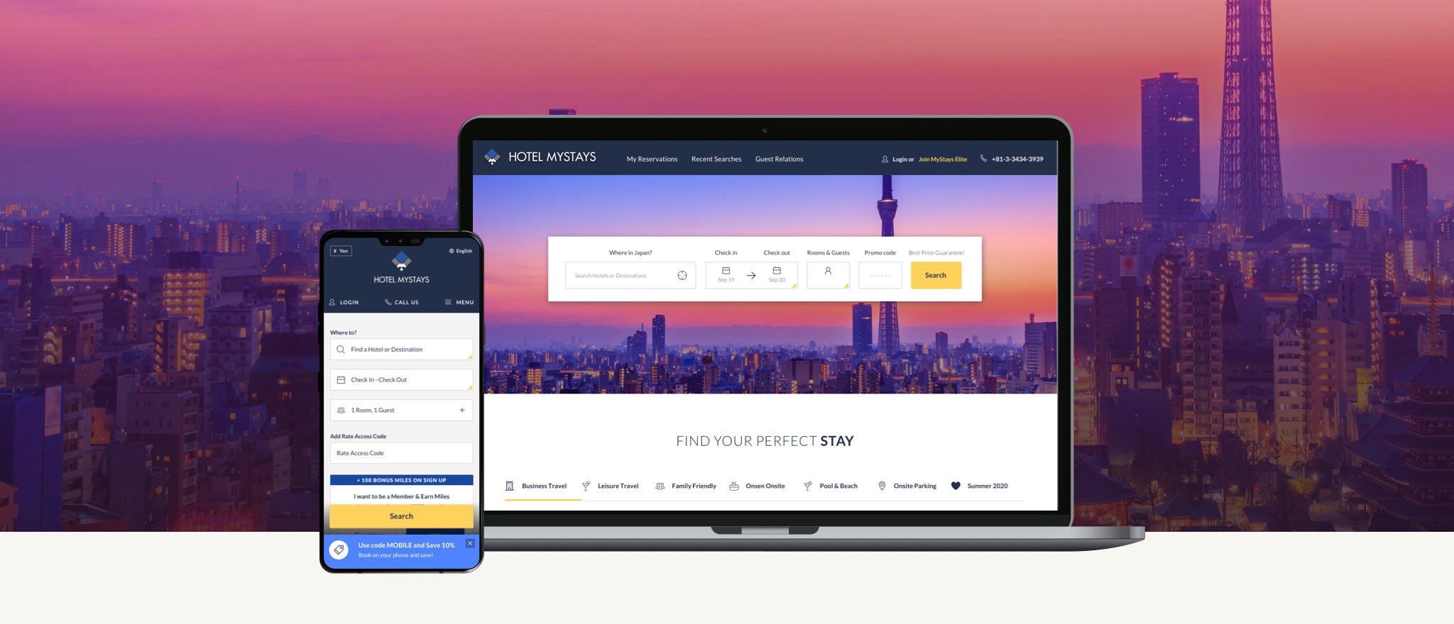
client / 2019-2020MyStays Booking Engine
my roleUX + UI Design, Product Design
the challengeMyStays, a Japanese chain level hotelier with over 30+ locations, were positioned to launch an OTA style booking engine for their brand. They wanted a mobile first design with the hope of branching out to more American users and to integrate a new loyalty program. Their team came to us ready with initial wireframes and a ton of ideas but wanted our design expertise in streamlining and designing the product.
Features vs FunctionalityHow might we pare down features without sacrificing functionality?
Features are nothing if they don’t serve a purpose. Although MyStays came to us with some initial wireframes to help communicate what the team was looking for, their mantra of “more is better'“ was getting in the way and creating user confusion. One of my main struggles early on was the sheer amount of features they required without much purposeful thought behind how or why the user would use them. The ultimate user goal of searching and booking was getting lost in MyStays’ extensive options and overly verbose user messages.
The first design step was to distill a key intent from every client wireframe–distinguish business requirements vs. user requirements. Brainstorming and ideating with a junior designer, I focused a lot on creating clarity on each and every interaction the user would need to take in order to move forward with as little friction as possible. Once the main steps of booking a room were established, then additional features could be added with purpose and visual context.
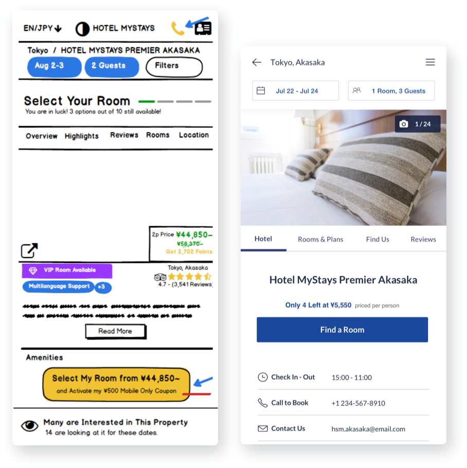
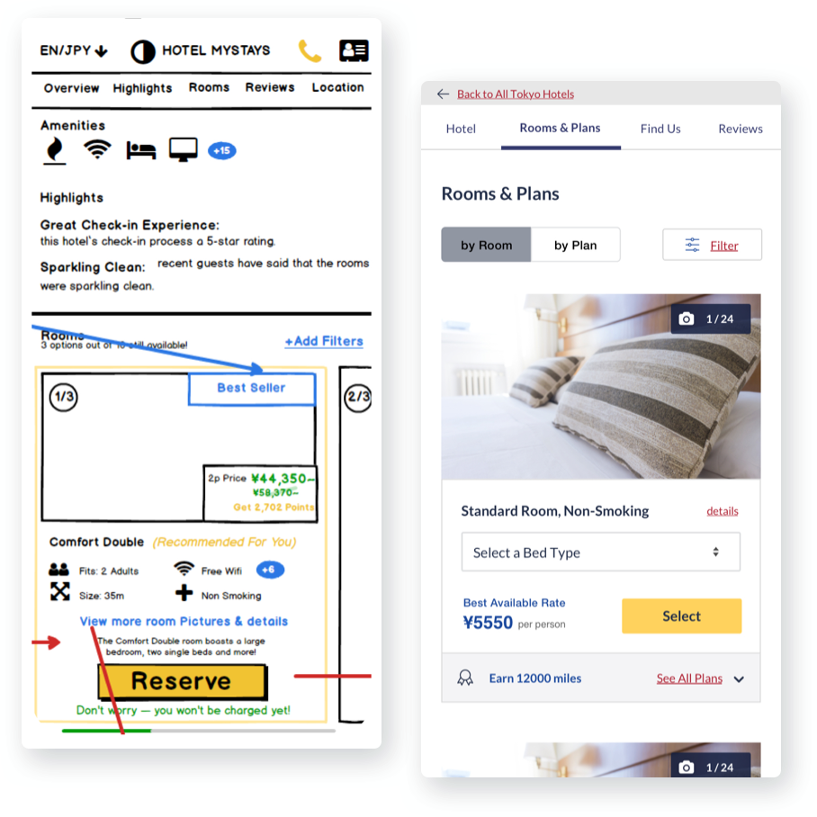
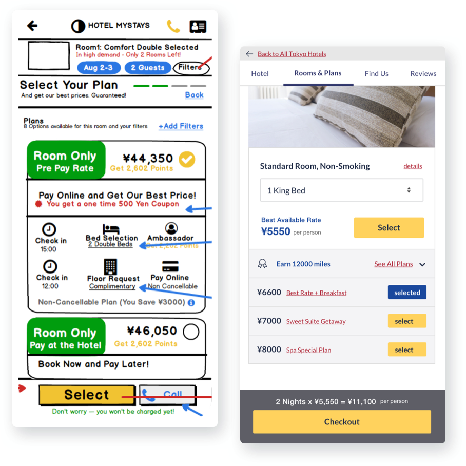
client created wireframesstep 1: search (find hotel)step 2: research (hotel Details)step 3: comparison (room selection)step 4: Book (rate selection)Working along with Stephanie Schellin, a junior designer, we sat down to a few brainstorm sessions, live sketching ideation and alternate layouts via Invision’s Freehand tool.
The steps of bookingStudies have shown that the more options that we present a user, the more overwhelmed they feel, resulting in decision fatigue and site abandonment. I wanted to clarify the steps so that each step was a clear, simple decision making process. Below are some of the resulting changes that were implemented:
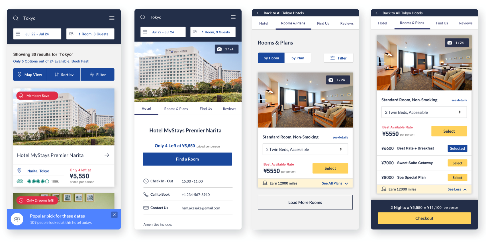
step 1: search (find hotel)Redesigned top navigation and search to focus on users' top 3 requirements: location, dates, and number of rooms/guests and allow for direct editing.
Changing directive text, ‘Select Your Hotel’ to helpful informative text, ‘Showing 123 Results…’ .
Provided a way for users to close bottom popup, which can often prohibit user search by getting in the way.
Simplified user options, view types, sorting and filters, and centralized these functions in a single, cohesive area.
Allowed for a single hotel card to show on mobile for clearer user legibility.
step 2: research (hotel Details)Reorganizing content hierarchy to prioritize hotel room photos. 90% of all users want to see their rooms before booking.
Added photo icon and a simple gallery for multiple photos.
Shortening the sub-navigation to top 4 items: hotel, rooms & rates, location, and reviews. Too many options for not enough content.
Updated the call-to-action to be a clear, singular directive and allowing any alerts or pricing incentives to be secondary. Instead of placing at the bottom of the page, inserting within the flow of the content to have more relevance.
Listing out alternative methods of booking and other important information to the user.
step 3: comparison (room selection)Pinned page sub-navigation allows user flexibility and provides a visual path for users to explore but still navigate back to all hotel choices.
Simplified user options, view types, sorting and filters, and centralized these functions in a single, cohesive area.
Adding a pre-selected field for bed type options, allowing for the best available rate to refresh in real time.
Allowed for a single hotel card to show on mobile for clearer user legibility.
step 4: Book (rate selection)Rather than force the user to select a room and then select a rate, the new layout allows the user to view the room and explore rate options before committing to booking.
Simplifying the rate packages to the most important value comparison, the price.
Removed the pre-paid option from this step and relocated to the checkout process, where it has more context.
All other valuations, i.e. description, rewards, and limitations, etc. are provided in a single, separate link.
Distinguishing ‘select’ from actually booking by providing users with a preview of real pricing and the finality of “Checkout” call-to-action.
Final resulting designstep 1: search (find hotel)step 2: research (hotel Details)step 3: comparison (room selection)step 4: Book (rate selection)The Results
The client was more than thrilled with the final outcome of our design and UX treatments with plans on building and implementing it with a third party development team at their headquarters in Japan. Launch was initially scheduled for Summer 2020, but unfortunately was delayed due to the pandemic.
next project

